
The biggest gains are often when we see a shift from one industry to another or one asset group to another asset group. We have a bit of both in the process of happening.
- Nasdaq 100 – chart and Inverse chart.
- Over-heated sector – Semiconductors
- About to Break-Out Upwards – Gold and Gold Miners
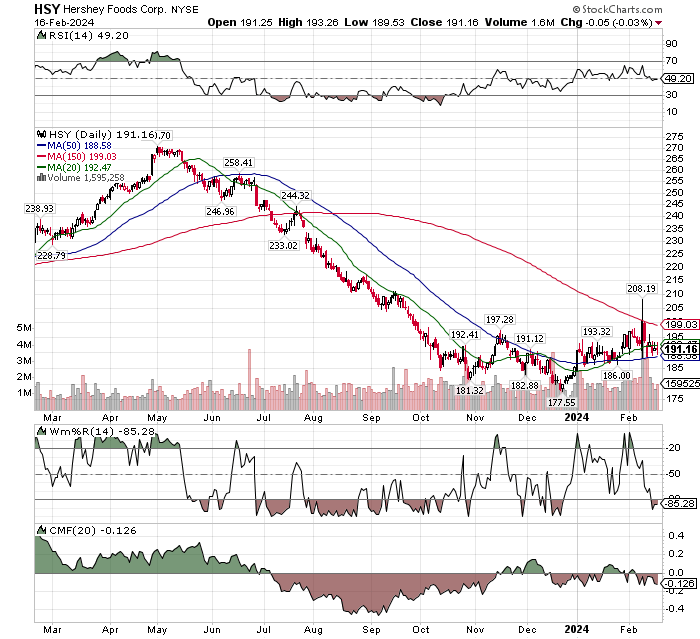
- Basing and about to move to a Stage 2 chart – Hershey Foods (HSY)
The NASDAQ ETF, QQQ, is still in a strong upward trend but by historical measure it is as over-bought as it gets. Be careful and consider scalping some money from the position or the leading performance positions in the ETF. Link to the top ten position in QQQ here.
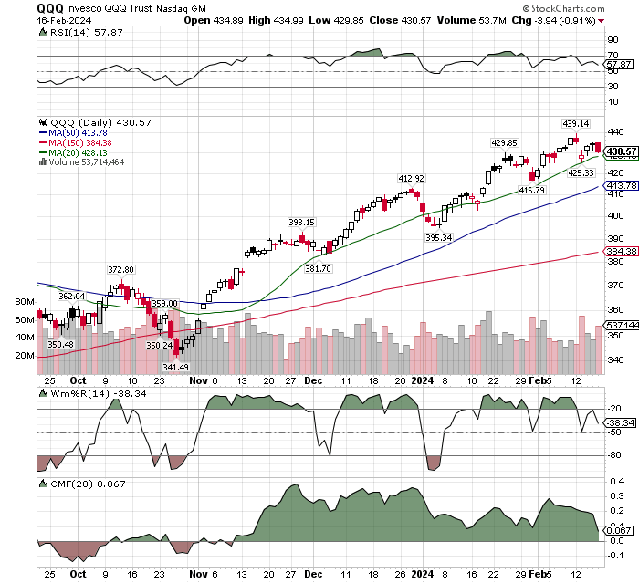
It is to early to call a top but there are some early warning signals for at the least a correction. RSI is weakening. Wm%R has fallen out of overbought. CMF is starting to decline.
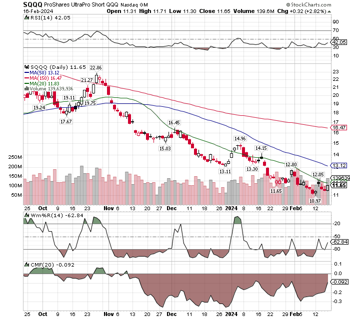
Below is the Inverse ETF for the NASDAQ 100 (SQQQ). We show this as a different perspective on viewing the NASDAQ but from the perspective of, if this were a stock you did not know, would you have an interest in buying the chart?
To my eye is would be a consideration as CMF is showing accumulation in it early stage. Wm%R are a trading indicator is rising off a double bottom. Relative Strength (RSI) is starting to rise Vs other stocks. Certainly not a trend but suggesting a position from which a trend could develop.
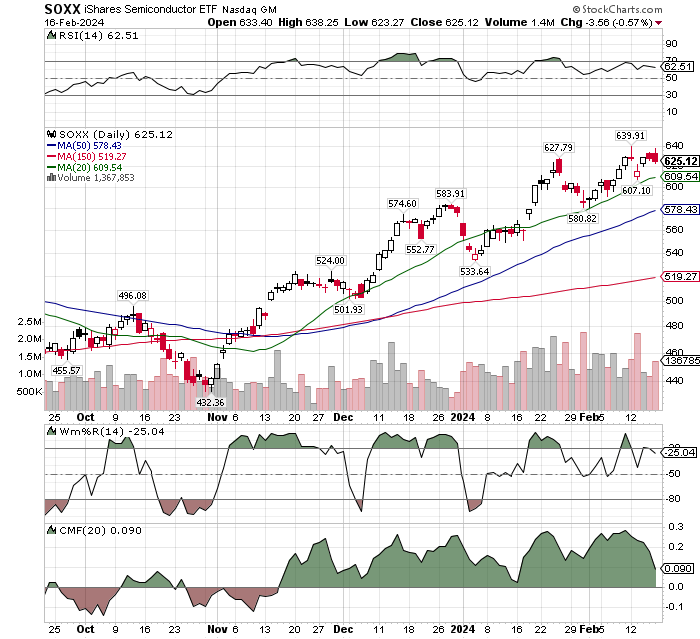
The trend is still up-wards for the semiconductor ETF, SOXX, but it is showing early indications of being tired. Trading index Wm%R has fallen out of its over-bought reading and CMF is in a decline as well. Moving averages are still below the share price. It is the next warning moving to sell signal to appear. If you own this, you might skim some profits with a closing break below the 20-day MA and more at a closing price below the 50-day.
LOTM does not normally sell-short in the market, so we are not going there in this presentation. The semiconductor index is in a very powerful up-trend and short sellers are littered by the road-side in bubble markets. If point of fact, traders attempting to short the semiconductors are part of the reason the price is so extended. The spike upwards are short seller’s buying from getting liquidated through buy-back of their shorts.
My profile is that I am usually early in trading calls. We suggest always staging into a position. This is true if we thin in terms of da day trade or a three year-position trade. Three buy in’s minimum – even if day-trading.
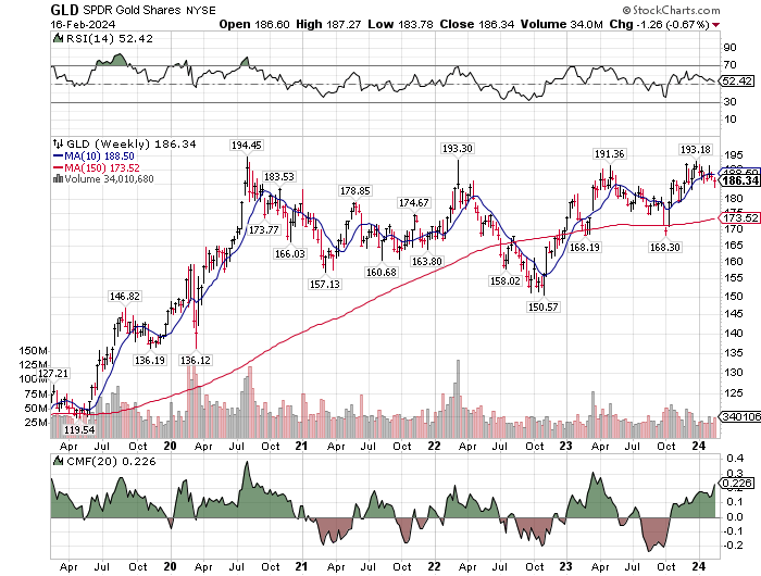
Physical Gold is giving every indication that it wants to break-out in an upwards direction. We left out the Wm%R indicator as that is a two week short term trading indicator. What we are looking at above, is a five-year chart of the major trend for gold. A two week trading indicator in a five year period is not important.
The Accumulation/Distribution indicator CMF is showing strong accumulation of physical gold. We also see this in te numbers from many Central Banks accumulating physical gold.
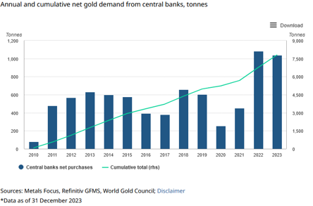
Chart of Gold Miners represented by GDX Large-cap Gold Miners Below:
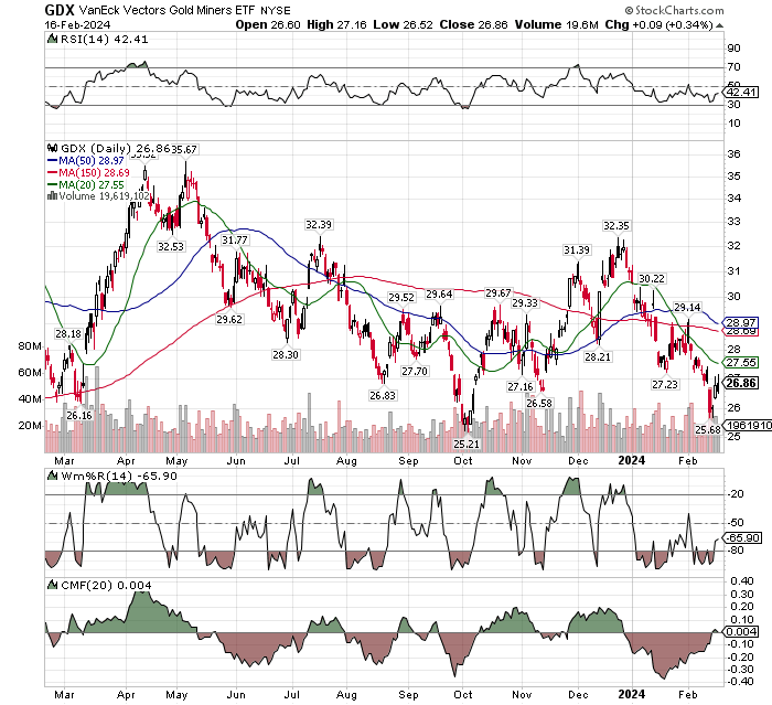
The chart suggests gold miners are at twelve-month, over-sold low with CMF indicator showing accumulation starting to turn back up. This suggests a low risk entry point for mining stocks.
What we are sharing in the chart below is the price of Physical Gold (GLD) with Gold Miners – large Cap (GDX -in gold color) and Junior Gold stocks (GDXJ – shown in blue).
This is a five year chart. Notice in 2020 March, when gold miners (large and small) traded at a discount to Physical Gold (GLD) and again in 2021 September, and now again in February 2024. In the first two examples gold miners (large) bounced back to even to physical gold or to a premium to physical gold (large and small miners). The move back happened in short-term mining stock bursts. We believe physical gold will break-out in 2024, The mining companies stocks will return to trade even with to a premium to their relationship with physical gold.
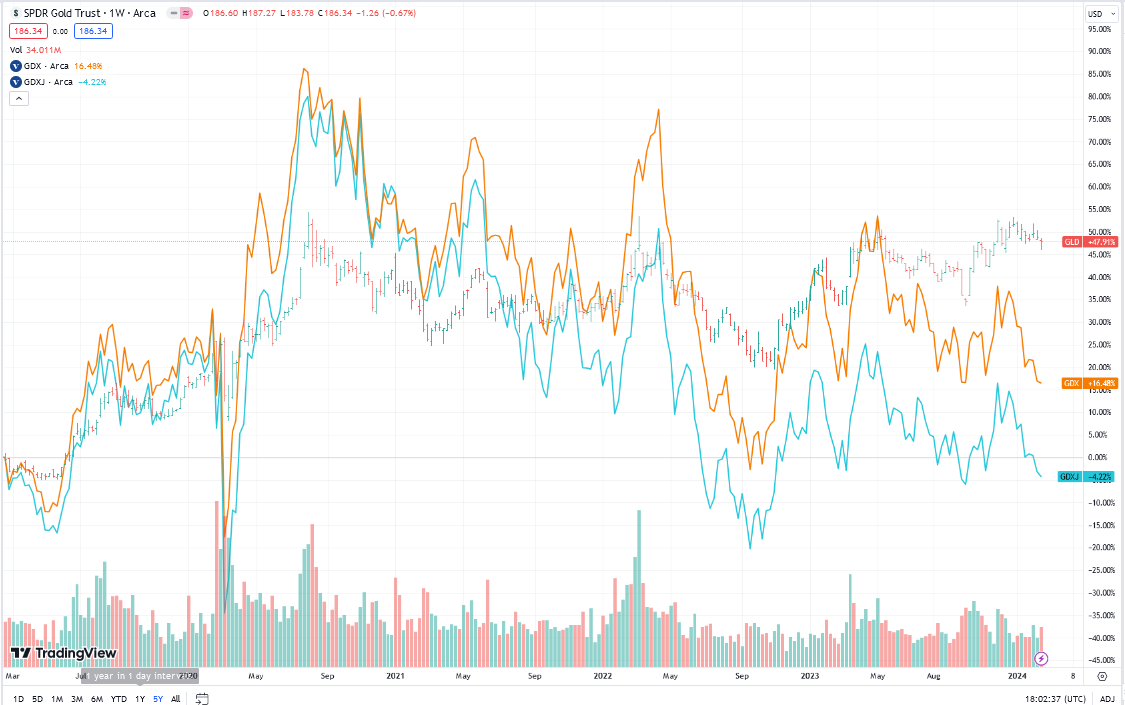
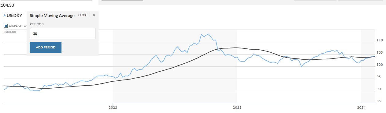
Chart Sourced from MarketWatch.
The US Dollar (DXY) as shown in the chart above suggest the US Dollar is at a price resistance area. Should the USD weaken, it is more often a positive for gold. The certainly have been times where the US Dollar as strengthened, and gold moved higher as well.
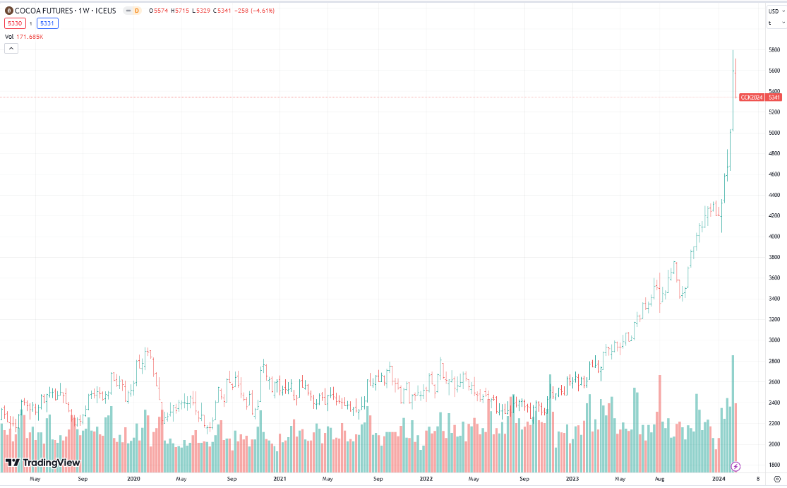
Cocoa futures have had a big run from late 2022, that now appears to be in a blow-off, topping stage. Falling cost of raw material for Hersey would be a positive for earnings and therefore its stock price.
Hope this is helpful. T.
Some of the ideas above were borrowed from Gareth Soloway, Bill Powers and Crescat Capital
#investing #valuestocks #growthstocks #gold #silver #crypto #blockchain
Available for Coaching, Training or Mentorships
Most money is made and lost in managemnt or lack of management of positions or portfolio.
Contact Tom by email if you think I can be of assistance.
LOTM Research & Consulting Service
* An account related to LOTM holds a position in this security.
Neither LOTM nor Tom Linzmeier is a Registered Investment Advisor.
Please refer to our web site for full disclosure at www.LivingOffTheMarket.com ZTA Capital Group, Inc.
To Unsubscribe please select “return” and type Unsubscribe in the subject line.
![]()